Welborn Media and the Chino Valley Chamber of Commerce Website

Lacey and her brother Zeb Welborn founded Welborn Media. She has designed and launched websites, several projects, marketing materials, a podcast, a book and more. Her passions include her family, her friends, creating things and helping businesses grow.
Latest posts by Lacey Welborn (see all)

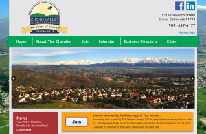
At the beginning of 2012 Welborn Media joined the Chino Valley Chamber of Commerce. So far we’ve attended numerous events, given a handful of helpful presentations, met so many hardworking business leaders, and Zeb has become an Ambassador for the Chamber. Recently we were brought on to redesign the Chino Valley Chamber of Commerce website.

About the Chamber:

“The Chino Valley Chamber of Commerce continues to be the largest and most comprehensive business organization in the Chino Valley speaking on behalf of its member firms. Members include a mix of companies of all sizes and industries, from entrepreneurial start-up companies to large long-established business entities. The Chino Valley is indeed “Open” to business and the Chamber works to make this community a premiere place to do business.”

We were excited to get the opportunity to create a website that would be able to benefit so many people in our own community, whether it be business owners who would like an online presence, or residents looking to find out more about businesses and events in the community.

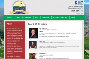
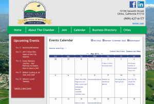
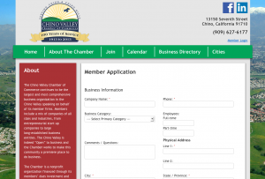
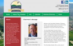
The old Chino Valley Chamber of Commerce website was difficult to update and difficult to navigate. We wanted to make sure we gave our chamber something much more useful, for chamber members and visitors to the website alike. We decided to use WordPress as a content management system in tandem with ChamberMaster, a powerful easy-to-use member management software created specifically for chambers of commerce. By keeping the design clean and modern we were able to create a site that is easy to navigate while still representing the Chino Valley. Here are some screenshots of our chamber of commerce website design:

Chino Valley Chamber of Commerce Website - Business DirectoryChino Valley Chamber of Commerce Website - Board of Directors
Chino Valley Chamber of Commerce Website - Events CalendarChino Valley Chamber of Commerce Website - Join, Sign up
Chino Valley Chamber of Commerce Website - About the ChamberChino Valley Chamber of Commerce Website - Home Page

Check out the new Chino Valley Chamber of Commerce website and let us know what you think!

Click over to our Clients page and scroll to the section Website Design to see some of the other websites we’ve built.

Design a Customized Profile Image for Your Facebook Business Page

Lacey and her brother Zeb Welborn founded Welborn Media. She has designed and launched websites, several projects, marketing materials, a podcast, a book and more. Her passions include her family, her friends, creating things and helping businesses grow.
Latest posts by Lacey Welborn (see all)

One of the many things we do is set up Facebook Profiles. It is important to fully fill in profile information and to have a to-the-point description in the About section, since that always shows up on the side bar on the left of the Facebook page.

We do these things, but our favorite part of setting up a Facebook Business page is creating the page’s profile picture.

The maximum width for a Facebook image (as displayed on the profile page) is 180px. Which isn’t a whole lot of room. The good thing is that this image can be much longer. The maximum height is 540px (as displayed on the profile page). Which makes a good size space for you to add some color to a page, add information, or add an image that really expresses the brand.

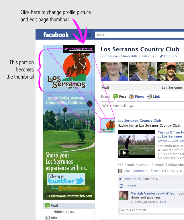
One important thing to keep in mind is the page thumbnail. The thumbnail is the small square image that shows up next to your page name whenever you post on Facebook. This thumbnail is taken from your profile picture. To get a good thumbnail make sure there’s a square portion that’s almost as wide as your profile image dedicated to giving your page a good thumbnail. (To set your page thumbnail: After you post your profile image you can click to ‘change picture’ and ‘edit thumbnail’ to pick the appropriate part of your profile image to be the thumbnail.)

When designing a Facebook profile picture I usually make sure the logo takes up nearly the whole width of the image, that it has a square portion all to itself, and there’s no distracting background behind the logo. This portion will make up the thumbnail. Then I work with the colors and the attitude of the business to create something appealing and attractive. Sometimes it is important to get more information in the Facebook image, one thing I always try to include is some contact information. It should always be easy to find out how to get in touch with a company. I always keep the Facebook layout in mind when designing these pictures. Once I get the image together I like to put it into a screenshot of a Facebook profile so that I can really see how it’s going to look on the page. After a little fine tuning and approval from the business owner we post it up and admire how much a well crafted profile picture can really enhance the look of a Facebook page.

Keeping the Facebook layout in mind can let you have a little fun with profile images.Try adding a shadow to the edges of an profile picture to create a little bit of depth, or use the white background to your advantage by adding rounded corners. The white background could also be useful in creating a super 3-d look, a photo at an interesting angle with a white background could be used in the profile picture to create a really dynamic effect.


Lacey’s super special tip: Most people recommend that the Facebook page profile picture be 180px wide by 540px tall, but it’s better to upload a page image that is 250px wide by 750px tall. That way when the profile picture is opened the image viewer it will be full size.

If you would like help setting up a Facebook page for your business, or if you already have one but want it maximized contact Contact Zeb Welborn at (909) 973-9088. Be sure to ask about the other Facebook services we provide.

How We Can Create Fun, Exciting and Customized Websites for Any Business

Lacey and her brother Zeb Welborn founded Welborn Media. She has designed and launched websites, several projects, marketing materials, a podcast, a book and more. Her passions include her family, her friends, creating things and helping businesses grow.
Latest posts by Lacey Welborn (see all)

I recently got the opportunity to design the landing page for a magazine website. While working out the details of the assignment my client told me, “I just want to see what you put together without a ton of input from me. I want you to go ahead and design what you think would work best and we can go from there.”

This is a good news/bad news situation. The good news is I have complete freedom. The bad news is that without the back and forth and asking, do you want this or that? it’s hard to figure out what the client really wants.

We already run the Twitter account for this business. She was very happy with the Twitter background I created for their Twitter profile page and she wanted to see what I could do for her new website.

After doing some research I had some good ideas for this webpage but was having difficulty fitting ideas together. Then my client sent me a message, sort of an outline of their plans for this new website. It had a list of the different sections they wanted on their website, the type of content they wanted on their page, but nothing about what they wanted for a design.  However, at the end of the document there was a section titled Brand Personality with a list: Friendly, Fun Creative, Inspiring, Imaginative, Informational, Educational, Savvy, Good Clean Fun, Social.

I wrote this list down. After reading the words a couple of times I knew how I was going to design the site. I knew how it would look. I knew this because I now knew how the site should feel.

After spending a few days developing the design I submitted a first draft mock-up to my client. They had some minor changes for me, but overall they loved it. They really liked the overall layout I set up. They loved how I integrated social media. They loved the feel the design achieved, saying that it was friendly and warm and still clean and organized.

I got to talk to another employee, whom I’ll be working with to get the site live, and he shared with me the joy my client had for the design I put together.

Apparently, they formerly had a full-time graphic artist who’s esthetic didn’t match my client’s esthetic. It was hard for them to reach design solutions that made the client happy. After getting it right on the first attempt my client has a lot of faith in me and has hired me on to help get the site live.

It can be hard to tell what a client wants. By paying attention and putting myself in their shoes, I was able to get some good ideas. Then, with the help of a few simple words, I knew how I was going to put it all together. It’s a design that I’m proud of and that my client is stoked about.

Now it’s a mad dash to get the site up and running to stay on the schedule. It’s going to be a busy week!  Stay tuned for the finished product when the site goes live.

If you are interested in getting customized websites designed for your business, contact Lacey Welborn at (909) 973 – 9088.

Five Tips for a Killer Presentation

Lacey and her brother Zeb Welborn founded Welborn Media. She has designed and launched websites, several projects, marketing materials, a podcast, a book and more. Her passions include her family, her friends, creating things and helping businesses grow.
Latest posts by Lacey Welborn (see all)

Whenever we meet a potential client we prepare a presentation for them. We share facts and ideas about what Welborn Social Media can do for their business.

Our presentations have been very successful.  Get our five tips for a killer presentation

Upon the completion of our presentation, our potential clients have a basic understanding of social media, how it can benefit their business, and, often times, business owners begin to see the massive potential social media has to offer.

Slide 1 of Our Presentation

Here are some reasons why our presentations are successful:

  • We alter our slide show to suit the business we’re presenting too. This is beneficial for two reasons:  we provide a personalized approach which gives us credibility that we can take their information and use it to communicate using social media, and it gives us on opportunity to delve into the business to better understand the needs of our customers.
  • We use lots of slides. Clicking through more slides during a presentation helps develop a strong, consistent flow of information to our potential customers. Instead of having one slide with a topic and three bullet points it’s much better for the tempo of the presentation to have four slides with very large, easy-to-read font.
  • Conversation is a must.  At the beginning of each presentation we explicitly encourage clients to ask questions.  Throughout the presentation we ask a lot of questions and make sure they are understanding the material we presented to them.  The presentation is less of a presentation and more like a guided conversation . . . our slides help guide the discussion.
  • Our slide show is very cohesive. It has a set color scheme, a few font choices and consistently placed items throughout.
  • While being cohesive we also have worked to make the slides more interesting. We have a lot of charts in our presentation to visually display some of the astounding facts around social media. We realized there were too many bar graphs and they became repetitive. By thinking of more creative ways to visually display information we’ve been able to make our slide show much more interesting.

Keep Slides Interesting

Our presentation is a constant work in progress. We are always trying to improve both the design of the slides and the manner in which we share them.

We love giving our presentation to business owners. By the end they can see the potential for social media in their business. They can imagine the success it can bring. They can visualize the ways it can allow them to share their passion for what they do.  Use our five tips for a killer presentation.

Working From Home: The Good, The Bad, and 6 Rules to Make it Work

Lacey and her brother Zeb Welborn founded Welborn Media. She has designed and launched websites, several projects, marketing materials, a podcast, a book and more. Her passions include her family, her friends, creating things and helping businesses grow.
Latest posts by Lacey Welborn (see all)

One of my favorite things about my job is that I can work from home.

Here’s the good and bad about working from home.

It’s GOOD because…
you have a flexible schedule.
you can sleep in.
it’s easier and often healthier to eat at home.
procrastination often leads to doing the dishes, cleaning the house, or doing laundry.

It’s BAD because…
there’s no one to keep you accountable.
it can be hard to get work started.
it’s easy to procrastinate.
there’s no interruptions to provide needed breaks.
you don’t spend time around other people.

There are definitely good and bad things to working from home. The important thing is to find solutions to the bad side of things. Here’s how I have found the balance to get all my Social Media work done on any given day.

#1 Create a Schedule
I decided this was necessary when I began postponing my start time for work every day. I tend to be more of a night owl. The main problem was that I would stay up later and later every night, then I’d sleep in more and more every morning. A big problem! I have set a schedule for myself. Even though I work from home and I could wake up whenever I want, I set my alarm clock. From the time my alarm goes off till I start working I have one hour to eat breakfast, check my personal email and social media accounts, anything that I want to do before I get to work. For me, an hour is a good amount of time to get everything sorted out before my work day begins so that I don’t feel stressed throughout the work day. Then I start my work schedule which lists each of my tasks.

#2 Follow the Schedule
You must follow your schedule. One of the benefits of working from home is having a flexible schedule. However, it is way more important to get everything done that needs to get done on any given day. For me I have written a schedule that includes how long each daily task takes. If I have a meeting to go to I can push some tasks back, but I still have a very clear idea of how long everything takes and how much time I will be working on any given day.

#3 Take Breaks
I mean short breaks. They really don’t need to more than 5 minutes long, but you should take a good amount of them (this is not including a longer lunch break). Preferably, you will use these short breaks to get up out of your chair and give your body and eyes a break from staring at a computer screen. This might be a good time to grab a glass of water. Or to quickly tidy up your room. Or perhaps to take a shower. If you work from home I highly recommend working a shower into your schedule.

Working from a coffee shop.

#4 Work Outside Your Home
Another great thing about working from home, is that often you don’t actually need to work from home. If you have tasks you can do on your laptop make yourself mobile and work from a coffee house or some other establishment with WiFi. For me, it can sometimes be helpful to work when there are other people around, even if I don’t know them. Also, ordering a drink from the Barista or striking up a conversation with a stranger in the coffee shop is a good way to make up for human interaction that you may have been missing out on.  Also, there is the chance that it will be a good networking opportunity.

#5 Know When To Stop
This rule is very important, but it also is the one most likely to be broken. The truth is, you need to get all the necessary tasks done every day. If you’re not going to be able to finish before your self imposed ‘quitin time’ then you need to work after hours to get it done. There are two key things to understand when it comes to following rule number 5. One: you must know what counts as a necessary task and what doesn’t. Two: You need to make sure necessary tasks don’t flood your schedule. Leave room in your schedule for things like self education (reading blogs, talking to colleagues, doing research in your field), random work related tasks, making new contacts; things that will help your business, things you maybe could do daily, but are not absolutely necessary. These tasks are what make your schedule flexible, if you have to cut back on them one day it won’t set you back for the next day.

#6 Love That You Work From Home
Working from home provides so much freedom and convenience. While the freedom could let you start work at 8am, or 12pm, or 2pm, or even 5pm; and the convenience makes it easy to eat a snack every fifteen minutes, or to watch just this one tv show, or to do your laundry and then iron everything and then sort everything so you know what you’re wearing for the next two weeks; freedom and convenience also let you meet up with friends at any given time, they let you travel and work from your laptop, they can make it easier to be healthier and they save you from sitting in traffic.

Embrace the good! Find solutions for the bad! And, be glad that you can do whatever you want so long as you do awesome work and make all your clients happy!

-Lacey Welborn
Discussing Social Media with Vendors

Lacey and her brother Zeb Welborn founded Welborn Media. She has designed and launched websites, several projects, marketing materials, a podcast, a book and more. Her passions include her family, her friends, creating things and helping businesses grow.
Latest posts by Lacey Welborn (see all)

At Welborn Social Media, we love discussing social media with all different types and sizes of businesses.  If you’d like us to present to your business, organization, group or discuss social media with you, please let us know.

This is from an email we sent out to Vendors from the approaching Scrapbook Expo in Ontario, CA. The Expo is happening November 3rd and 4th at the Ontario Convention Center. We’re hoping we can help some of these businesses with Social Media tips and consultations.

Dear Vendors,

Zeb and Lacey Welborn, the sibling team from Welborn Social Media, will be available at the Thursday meeting to discuss Social Media and answer any questions you may have. They work with several companies doing everything from running Facebook pages and writing blogs to doing web and graphic design.

Zeb Welborn got into Social Media after he started his own tutoring company. Wanting to gain more customers, he devoted his time and energy into learning the ins and outs of Social Media.

Lacey Welborn is the creative force at Welborn Social Media. Besides staying up to date on the latest best practices for Social Media, she also does web and graphic design.

www.WelbornSocialMedia.com
  

Designing Welborn Social Media

Lacey and her brother Zeb Welborn founded Welborn Media. She has designed and launched websites, several projects, marketing materials, a podcast, a book and more. Her passions include her family, her friends, creating things and helping businesses grow.
Latest posts by Lacey Welborn (see all)

I’m Lacey Welborn, Zeb’s younger sister and co-owner of Welborn Social Media. I represent the creative side of Welborn Social Media. My tasks consist of graphic design and website design as well as everyday Social Media activities. My most recent project was designing Welborn Social Media.

Creating this website was the most difficult thing I’ve designed. It was difficult because of my own desire for it to be awesome. I so badly wanted it to be perfect, to express our company, to be the best thing I ever designed. Unfortunately, I don’t think it is. There are things I like very much about it, but there are other things that I’m not as confident in. I love my idea for the background; it’s Facebook and Twitter posts, tiled together, stylized and at an angle; a perfect backdrop for the Social Media work we do. I like the layout of the footer, it has links to 15 different things, but it’s clean, very clear, and easy to understand. There are a few design elements that I feel unsure about.

The thing I realized is that if I’m not designing for an art project, but for a very practical purpose, there are things that are more important than a perfect design. Like time. The truth is, it could take me months to create something that I feel is perfect (more likely, a lifetime). That would be wasted time. Our company has already started, we work on the web and we need a website. We need our own internet presence. Realizing that getting this website up ASAP was the number one priority meant that I’d have to let some things go. I decided that as long as the information was there and the message was clear, then it would make it to the next round of my design process, which is getting approval from friends and family. When I showed it to them, they all thought it was great. That and the knowledge that you can always make changes to a website helped calm my inner critic.

Designing Welborn Social Media was a difficult project and the realization that I couldn’t make our Welborn Social Media site perfect was tough to swallow, but it was necessary. I think all commercial designers have to learn the lesson that sometimes it can’t be perfect.

I still need to finish the design for the Our Clients page. I really really want that page to be perfect since it features the wonderful companies we work with, and the killer Social Media work we do for them. But, since the purpose is to share that information with the world wide web, I know it is more important to get that page up sooner rather than later.

Since this website has gone up, I’ve gotten more positive feedback. I feel a little better about the things that I felt unsure about. And, now we have a website! Yay!

Please comment and let me know what you think about the website. I would really appreciate more input.